
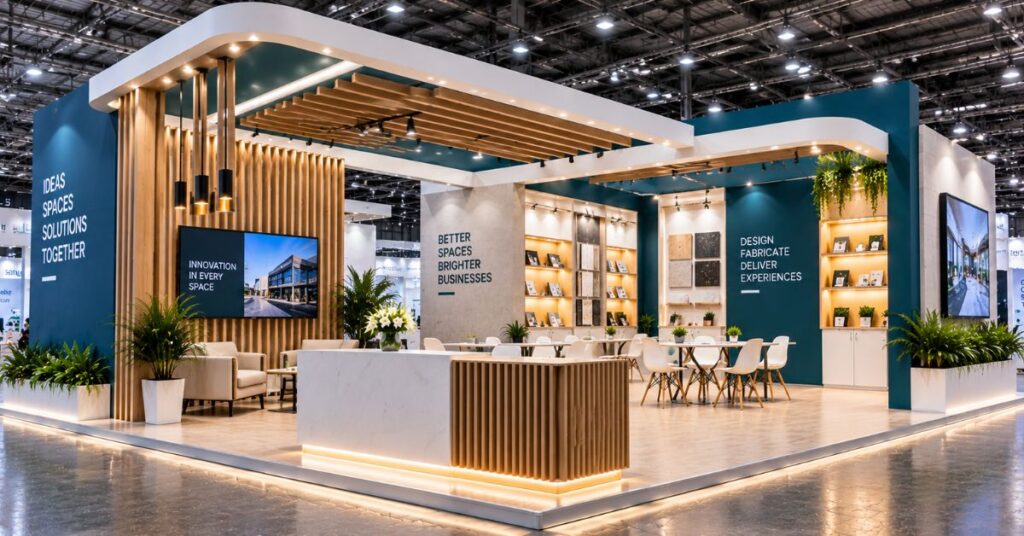
Visitors decide in a few seconds whether to walk into a stand or keep walking. Smart exhibition booth design helps them decide in your favour. These tips cover layout, visitor flow, lighting and graphics, and apply to stands of almost any size.
Plan the Layout Around Visitor Flow
Think of the stand as a path: entry, attraction, conversation, exit. Keep the entrance open and avoid placing a counter across the front, which acts like a wall. Leave enough room that a small group can stop to look without blocking the aisle.
Use Open Sides to Your Advantage
If your stand has two or more open sides, put the strongest branding on the side facing the busiest aisle. Corner stands benefit from a feature, such as a tall sign or a lit wall, that can be seen from both directions. This is a core part of good exhibition booth design.
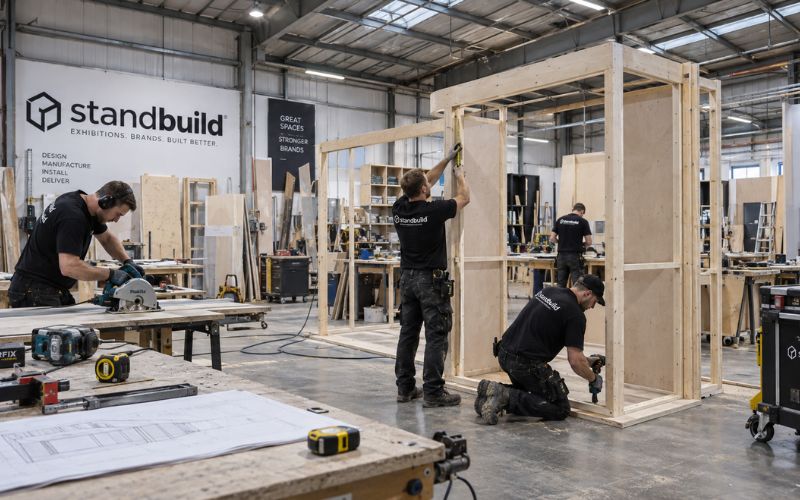
Create One Clear Focal Point
A stand with ten attractions confuses visitors. Choose one hero element, such as a product on a lit plinth, a large graphic or a demo area, and let everything else support it.
- A tall brand sign visible from a distance
- A hero product or demo
- A welcoming reception point
Light the Stand With Purpose
Hall lighting is flat, so your stand needs its own. Use spotlights on products, warm light in meeting areas and a lit logo that can be read from across the hall. Plan sockets and cabling in the design, not on build-up day.
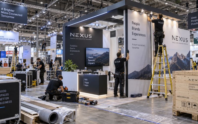
Keep Graphics Short and Readable
Use a headline of six words or fewer and one supporting line. Large images of products in use work better than long text. Test the graphic by looking at it from five metres away: if you cannot read it quickly, it needs to be simpler. See examples in our project gallery.
Include Space for Real Conversations
Counters are good for quick enquiries, but serious buyers want a place to sit. Even a small meeting corner with two chairs and a table can increase the quality of your leads. Add hidden storage so brochures and bags stay out of sight.
Common Mistakes in Booth Design
Some mistakes are easy to avoid. Too many products on display make the stand look like a storeroom. A high counter at the front blocks visitors. Dark colours without enough lighting make the stand look smaller. Tiny text on graphics cannot be read from the aisle. Good exhibition booth design removes these problems at the 3D stage.
If you are unsure, ask your designer for a view from the aisle at eye level. It shows how real visitors will see your booth.
Frequently Asked Questions
What size should my exhibition booth be?
It depends on goals and budget. Start from the number of people you want to host at once and the products you need to show.
How important is lighting?
Very. Good lighting makes products and graphics stand out in a crowded hall.
Should I use a lot of screens?
Use them sparingly. One or two well-placed screens work better than many that compete for attention.
Final Thoughts
Strong exhibition booth design is a series of simple decisions: open front, clear focal point, good light and readable graphics. Ask your designer to show you how each decision supports a specific goal for your show.
Planning Your Next Exhibition?
Share your show name, stand size and budget with our team on the contact page and we will come back with a clear plan. You can also read about our exhibition stand design services and in-house fabrication.
Related reading: Dubai Build-Up Windows Don’t Forgive Delays: Choosing a Fabricator Who Delivers.